Byeongjin Kim (김병진) presented a paper entitled “Color Adjustment of Brand Logos for Dark Mode Display,” co-authored with Giyun Lee (이기윤), at the 33rd Color and Imaging Conference (CIC33) in Hong Kong. Originating from Giyun’s master’s thesis, the study explored how designers optimize brand logo colors for dark mode displays. Byeongjin delivered insightful findings that drew strong interest from color researchers at the conference, who encouraged further investigation—such as applying advanced Color Appearance Models. The audience also suggested extending the study to broader page layouts that include not only logos but also images, text, and even motion graphics.
Abstract
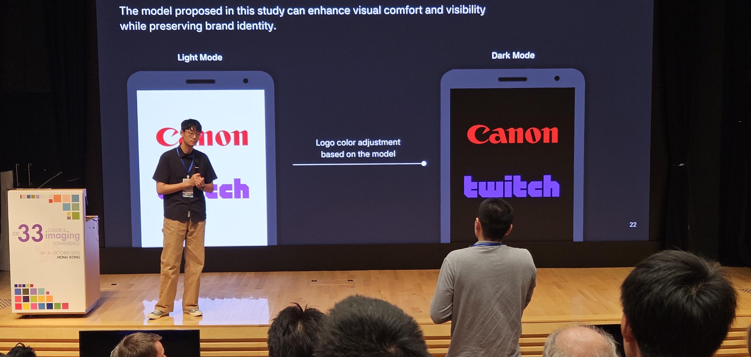
We investigated how to optimally adjust brand logo colors for dark mode displays without compromising their original color identity. Through analyzing manual color adjustments of logos placed on black backgrounds (N=31), we figured out that designers tend to light up the dark-colored logo, while pale down the colors of bright logo. A tendency similar to that of their adjustments converging in a specific direction was obtained, so we derived a surface model that represents the direction in which original colors tend to shift. This model incorporates the L*, C*, and h* attributes to guide the computational adjustment process. This study offers a structured method for adapting logo colors to contemporary display contexts, effectively linking algorithmic solutions with design intuition.